UX Upgrades for Pension Fund Sites
Overview
Challenge
In close collaboration with Online Marketing & Communication, we set out to enhance the user experience of the current pension fund websites. With a new website planned in three years, we focused on quick win solutions (low-effort, high-impact). Our task:
Optimize the user experience of existing pension fund websites by introducing new UI components designed to drive engagement and usability.
Create a more intuitive and accessible interface to benefit the fund's 4.5 million participants.
Constraints
Style and CMS alignment
Each fund has its own style guide and unique CMS limitations within Adobe Experience Manager. New components had to fit seamlessly into these existing structures.
Alignment with future design system
I designed every component to align with the upcoming design system, easing the transition when the complete redesign launches in three years. By introducing familiar patterns now, we aimed to create a smoother onboarding to the future site.
Focus on impact and efficiency:
With a full overhaul planned, we concentrated on low-effort, high-impact components that would make an immediate difference, balancing strategic design with practical constraints.
Project details
My role
UX/UI Designer
Team Collaboration
Close collaboration with Online Marketing & Communication teams and the Development team responsible for the current website.
Timeline
January - December 2024
Stakeholders
ABP, bpfBOUW, Pensioenfonds Schoonmaak, PPF APG, SPMS, SPW, PFAB, BTER fondsen (3x), impacting a combined user base of approximately 4.5 million participants.
Let’s dive into 3 highlighted components
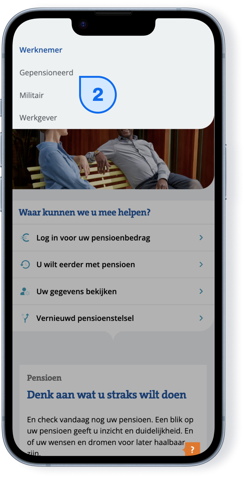
Simplifying profile selection
Problem
Users were struggling to locate and select their correct profile—especially on mobile. We noticed they were often lost, uncertain, and hesitant to choose, causing frustration.
Change
I dove into users’ mental models around profile switching, analyzing their thought process and preferred navigation. By leaning into familiar patterns, I designed a new profile selection component and tested it through A/B tests in Adobe Target.
Result
This change made profile selection more intuitive and accurate, giving users confidence in their choices. Early usability metrics show a marked improvement in ease of use, with conversion rates currently under analysis.
Hero update: Engaging CTAs, less scroll
Problem
Home pages feature a large, non-interactive hero image with no call-to-action, despite this being a powerful feature on most landing pages.
Content and landing pages had overly long titles, breadcrumbs, and images, which pushed CTAs below the fold and reduced user engagement.
Change
I redesigned the homepage with an engaging CTA feature and a more accessible layout: a clean title with optional items like a subtitle, body text, and two prominent CTAs.
Content pages got streamlined breadcrumbs and a title with optional items like a subtitle, body text, and two highly visible CTAs right in the hero.
Home page
Content page
Result
Content and landing pages saved up nearly 600px(!) in height, improving CTA visibility and user engagement.
Conversion rates are currently being analyzed.
Compact cards: Emphasis with efficiency
Problem
On mobile, image cards were massive, creating endless scrolling and clutter. Important options got lost amid unnecessary images, diluting user focus.
Change
Introduced compact cards as a new component, designed to highlight key interactions while saving space.
Recommended using other components alongside these compact cards to improve page structure and enhance the user experience.
Result
The page gained a clear, organized look that reduced scrolling up to 2308px—nearly three mobile screens’ worth—while maintaining the card’s strength by emphasizing specific interactions.
Conversion rates are currently being analyzed.

Next steps and takeaways
Lessons Learned
Effective stakeholder management was essential to balancing diverse requirements and priorities.
Prioritization played a key role, especially given the limited timeframe and resources.
Next Steps
The foundation for collaboration is solid, and we’re refining our build-measure-improve cycle to keep iterating.
Insights and A/B test results from this phase will directly inform the design of the new website, ensuring that every lesson learned here carries forward.


